The monthly well production data published by the North Dakota State Government will be used to estimate an average decline curve for a shale oil well in the Bakken. We show that the typical decline curve given by the North Dakota Department of Mineral Resources is overly optimistic by comparing the expected average production per field to the realized production. The decline curves given by David Hughes are close to our estimates, which lead to substantially better forecasts. ND state government data can be accessed for a subscription fee. We use data as made available by enigma.io. [1]
Geospatial Information
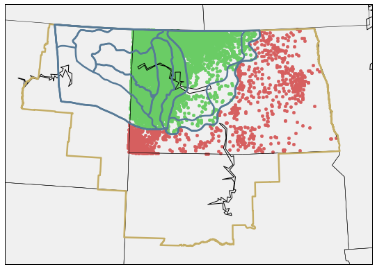
To visualize well locations in enigma.energy.oil-gas.well.nd, we overlay the boundaries of the Williston Basin Province Total Petroleum System containing the Bakken and Three Forks formations, dark yellow, and individual boundaries of the assessment units, blue. Wells within the Bakken are represented by green dots, wells outside are red dots.
USGS Assessment
The most recent USGS survey of the Bakken formation is available at pubs.usgs.gov. The typical oil production rate of a fracked well drops off sharply in the first two years. This rapid decline is drastically different from typical non-fracking wells. The USGS estimate of total recoverable oil depends on the productivity in the tail of the decline curve. There is not much long-term data for any given new field yet, and the ultimate recovery volume of a well is also influenced by the well life time. Economical factors, complicating the analysis of production data, are not included in their analysis.
Brent/WTI Oil Price, North Dakota Rig Count
We first investigate the relationship between the rig count in North Dakota [2], and WTI and Brent crude oil prices [3].
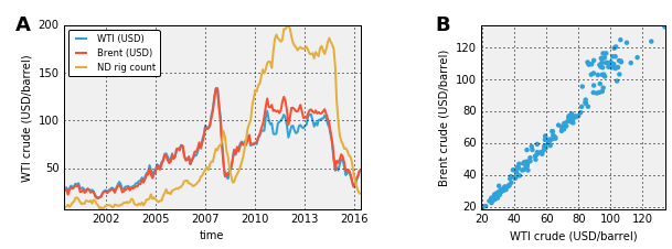
The data indicate that rig count is a lagging indicator, see Fig A. WTI and Brent are strongly correlated without lag, although they are decoupled in absolute value during the high oil price regime 2011-2014, see Fig. B.
Production Data
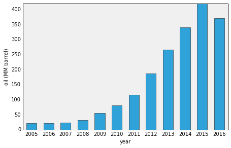
There are ~2.5 million entries in the file enigma-us.states.nd.dmr.oil-gas.log-tops as of July 2016, indexed by the unique API number of a well, and time. We can recover the production by field and by producer, as well as overall production. We first collect all production data for a well, aggregate all well data for a given field, and then resample the monthly production data to yearly intervals. The total yearly oil production in millions of barrels, for all fields in the Bakken, are given in figures A and B below. The drastic increase starting in 2007 is due to shale oil recovery using horizontal drilling, combined with fracking. As we set the year end to the end of June while resampling, the decline for 2016 is not an artifact.
Initial Production
We assume that the initial production is a good indicator for long term profitability. We select wells with an oil production maximum within July 2009 to July 2014 to minimize a potential influence of oil price, and restrict ourselves to the twenty most productive fields in terms of total volume (as of 2015, covering ~40% of the total output). We potentially introduce a selection bias doing so. We only have production data at a monthly resolution available, and will try to give a reasonable estimate for the typical decline curve using this coarsely spaced data.
We can cross-reference the measured well depth for each initial production value in the enigma.io datasets. The two figures below show initial production vs. measured well depth, as well as initial production vs. year, for the twenty most productive fields.
[The export to animated .gif has a bug. As a temporary fix, open this separate page.]
There is prominent clustering of measured well depths when plotting vs. initial oil production values. Horizontal drilling is employed and the measured well depth (MWD) is not equal to true vertical depth (TVD). The Bakken/Three Forks formations are at 2 miles =~ 10k ft TVD. We automatically select and label wells at around 15k/20k ft MWD via a clustering algorithm, see figure A. [4]
For lower measured vertical depths, the lateral extent of the well is shorter. We therefore might expect a lower oil production on average, while keeping all other factors equal. Both the Bakken and Three Forks formation likely have differences in their overall characteristics which we will ignore, thereby assuming that the variance within the two formations is larger than the differences between them.
For many fields, a clear rise in the magnitude of the initial production value can be seen in figure B, e.g. for Antelope and Spotted Horn. This increase is likely due to a better understanding of geological structure and increasingly experienced operators. Geological factors are believed to have a larger impact on production than technological advances, according to Theloy and Sonnenberg.
Decline Curves
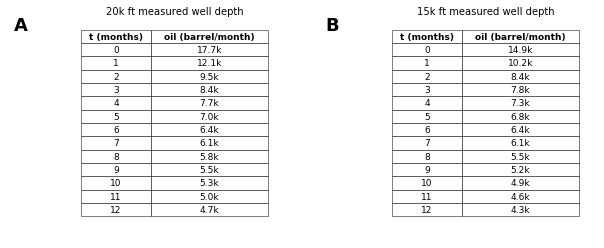
We shift all production curves associated with a label to a single start date in order to construct an average decline curve. We then collapse the individual production curves to the mean value for each month. This procedure will smooth away the influences of technical downtime, given a sufficient number of samples/wells. The results are shown in the figure below, and compared to the ND decline curve given at www.dmr.nd.gov.
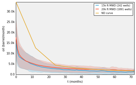
The solid blue and red lines represent the mean oil production in barrel/month for the indicated number of wells at 15k/20k ft MWD, see legend. The shaded area corresponds to one sigma deviation from the mean. The ND curve is systematically and substantially higher during the initial two years, and roughly agrees with the derived mean production curve for 20k ft MWD after around 3 years. The mean oil production for ~15k ft MWD is systematically lower than the production of wells at 20k ft MWD. Numerical values for the first year are displayed in tables A and B below. The total length of the two curves is 82 months.
Projection of Production by Field
We will use the average 20k ft MWD decline curve constructed above, as well as the ND decline curve, to extrapolate production values. We linearly extrapolate for the 20k ft MWD curve beyond 82 months, using mean production data from months 36 to 72. We will slightly overestimate production on an aggregated per-field level, which might be apparent should only few new wells be added over time. If many new wells are going into production, this small difference is expected to be neglegible. We linearily interpolate the ND decline curve data points to monthly values, which will overestimate production in the first two to three years by a some amount.
Using all wells with a peak in oil production starting July 2005, we project out production per well. We then aggregate the data on a per-field level. Some "legacy" fields will have some wells producing oil which we do not include in our model. The results for the twenty most productive fields are shown in the figure below.
[The export to animated .gif has a bug. As a temporary fix, open this page.]
The projection of total production for a field gives an idea how its wells compare to the average decline curve we constructed. Some fields systematically outperform the expected production from our deline curve (Parshall, Spotted Horn, ..), while others underperform with respect to the average wells (Little Knife). E.g. Sanish initially outperformed, but now tends to underperform. The ND decline curve clearly results in substantially higher projections than were realized. Only a part of this excess in predicted production is due to the linear interpolation.
Summary
The results of projections for total production per field, using our average decline curve for 20k ft MWD wells, look sensible. Our very rough estimate is close to the decline curves given by David Hughes. We likely are able to estimate the future production and well profitability on a per-field and per-operator level, using a custom decline curve for each field and e.g. the rig and well completion count. The ND decline curve appears to be based on a biased sample of wells, and substantially overestimates the typical production per well.
| [1] | enigma.io, enigma-us.states.nd.dmr.oil-gas.log-tops, enigma.energy.oil-gas.well.nd, and enigma.energy.oil-gas.production.nd |
| [2] | quandl.com, BKRHUGHES/RIGS_BY_STATE_NDAKOTA_LAND |
| [3] | quandl.com, ODA/POILWTI_USD and ODA/POILBRE_USD |
| [4] | Note: the clustering results for 15k ft are not ideal, but had only a minor influence on the curve derived when I checked different clustering parameters. |
Comments
Comments powered by Disqus